Basic Graph Tutuorial
Generating Graphs is a powerful tool for analysis. AFT Arrow has special tools to allow the user to create Graphs that have the ability to be regenerated even if the output data has changed due to model changes. Below are step by step instructions about how to make and manage graphs from one of the example models.
Create and run a fully defined model. For this example the “Compressed Air System.aro” model was used. The file should be at this location by default C:\AFT Products\AFT Arrow 9\Examples\US - Compressed Air System.aro. The scenario was Base Scenario/Hot Case. It is recommended to copy this file to your desktop and work this tutorial from the copied file as to not save over your example files.
To skip to different sections of this tutorial, use the links below:
Compressor/Fan vs. System Curves and Saving Graphs (return to top)
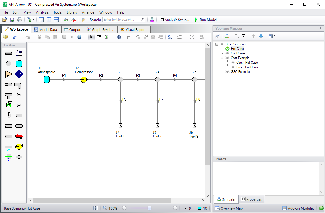
Figure 1: Fully defined model that can generate output and graphs
Go to the Graph Results Primary Window and determine what type of Graph you want to generate. The first Graph created in this example will be a Compressor/Fan vs. System Curve. The Compressor/Fan vs. System Curve is one of several different types of Graphs that can be made. This Graph is created by first selecting the Compressor/Fan vs. System Curve tab and selecting the desired parameters (for the example the defaults have not been altered) in the Parameters area. After the parameters have been selected, click Generate, and you will see the graph on the left.
Note that the Graph Guide, accessed by clicking on the "What Would You Like to Do?" icon on the upper right of the graph, will guide you through the process of creating a graph.
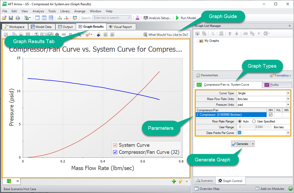
Figure 2: Graph Results Primary Window
The Graph has been created, but has not yet been added to the list under “My Graphs”. To add this Graph to the list, first select the “Add Graph to List” icon on the Graph Results toolbar. Name the Graph “Compressor vs. System Curve” (this option and many others can be accessed by right-clicking on the Graph at any time).
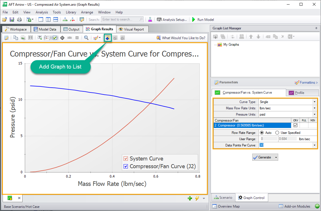
Figure 3: Compressor/Fan vs. System Curve
The Graph has now been added to the list and will be easily regenerated with the same format if the output changes. The name of the added Graph can be seen in the Graph List Manager. The border of the Graph has also changed to dark green along with borders of the parameters and the name of the Graph in the Graph List Manager. This indicates that that Graph has been added to the list, current, and that the displayed parameters are the ones used to generate the Graph.
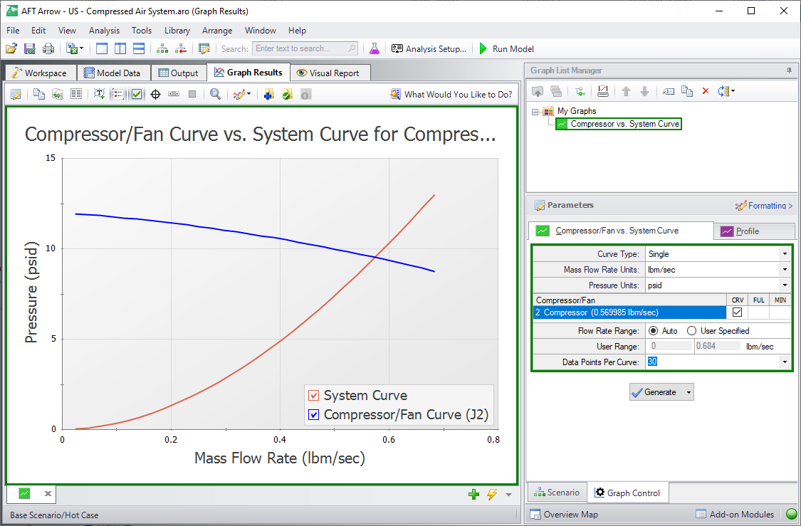
Figure 4: Compressor vs. System Curve added to the list under "My Graphs"
Formatting options are available by selecting “Formatting” above the different graph types. When formatting changes occur, the border of a Graph will change from dark green to light green. This indicates that a change has been made to a graph in the graph list. Another indicator that the Graph is not updated is the small yellow square over the icon on the tab. In this example, the title has been changed from “Compressor/Fan Curve vs. System Curve for Compressor/Fan 2” to a shorter title of “Compressor vs. System Curve” (this was done by right-clicking on the title and changing the text). These changes are not saved to the Graph unless “Update Current Graph in List” is selected.
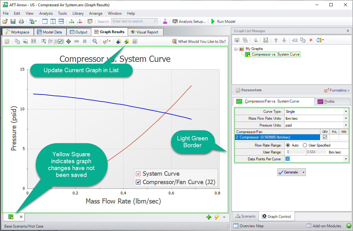
Figure 5: Compressor vs. System Curve with formatting changes
After selecting “Update Current Graph in List” the border has changed back to dark green and the yellow square has disappeared. This indicates that this is the current formatting of this graph, and that regenerating this graph will generate the same graph (according to the current model output).
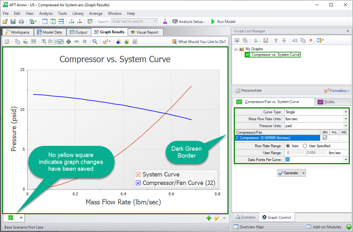
Figure 6: Compressor vs. System Curve with updated formatting changes
Profile Graphs (return to top)
The next step in the example is to make a new Graph in a separate tab. This is done by selecting the “New Tab” icon in the lower left. This Graph will be a “Profile” Graph that displays Stagnation Pressure along the length of the flow path from the Tank to Tool #4. Select pipes 1,2,3,4,5, and 9 or highlight the flow path on the Workspace and change the parameter to “Pressure Stagnation” with units of length in feet and units of pressure in psia.
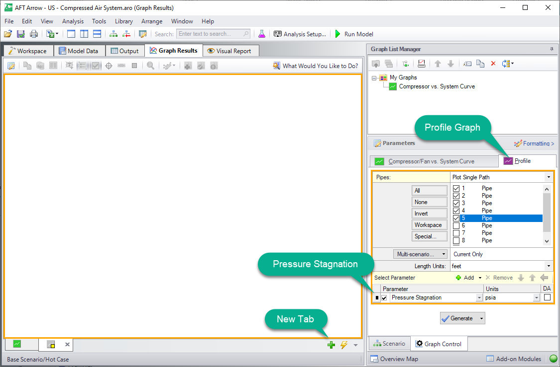
Figure 7: Generating a Profile plot with Pressure Stagnation
This Graph shows the pressure rise caused by the compressor that is very close to the tank and then a decline in pressure that results from major losses caused by friction in the pipeline. This Graph can also be added to “My Graphs” by selecting “Add Graph to List” on the toolbar. Name it “Stagnation Pressure Profile”.
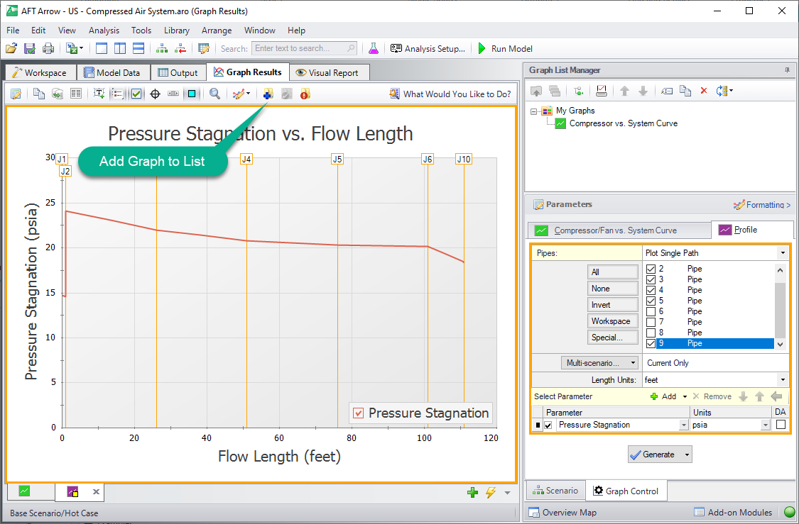
Figure 8: Pressure Stagnation vs. Flow Length
The Graph is now under “My Graphs” and the two Graphs can be switched quickly between by either selecting the Graph from the list, by clicking on the corresponding tab, or using Graph Tab Selection.
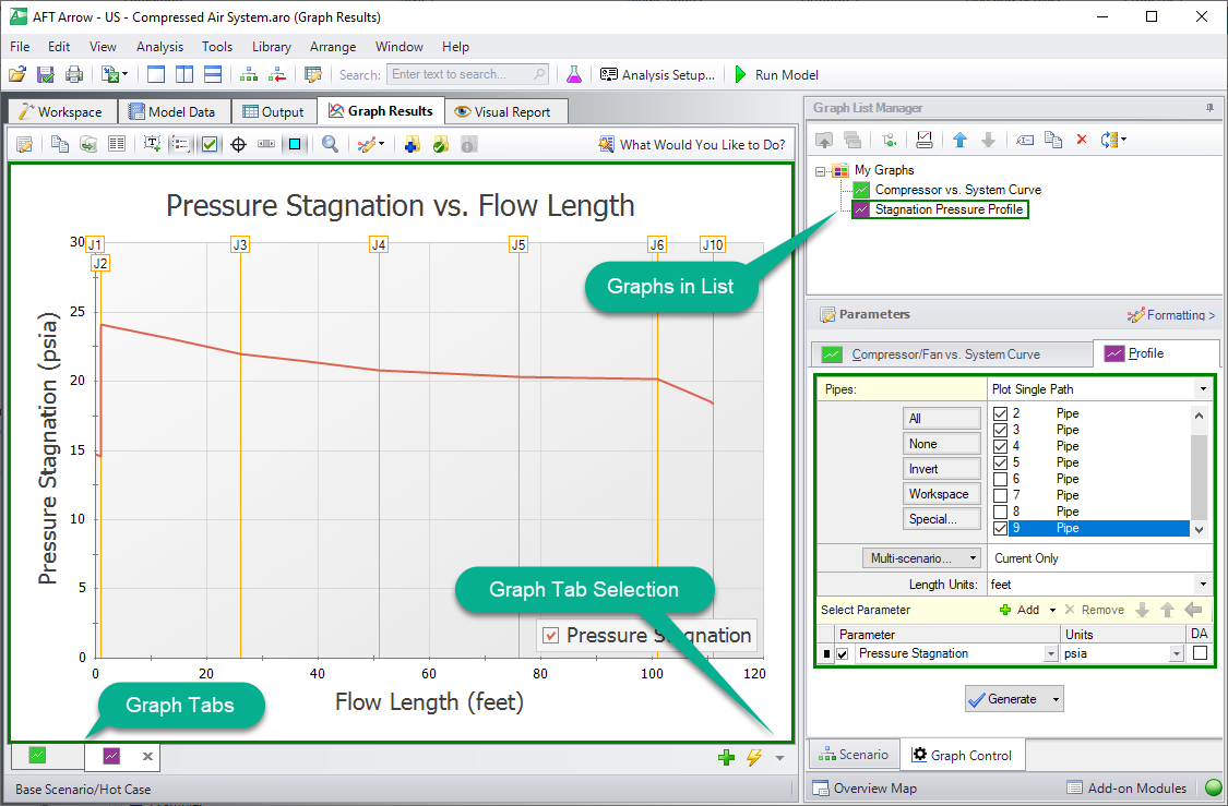
Figure 9: Stagnation Pressure Profile added to the list under "My Graphs"
Displaying Multiple Graphs Simultaneously (return to top)
It is now possible to close the Graphs and regenerate them either in their own tabs or all graphs in a folder in the same tab. To test this out close both Graph tabs and then select the “My Graphs” folder. The option to “Load Folder Items" in "Separate Tabs” and “Same Tab” are now available on the toolbar. For this example select “Load Folder Items” and then "Same Tab".
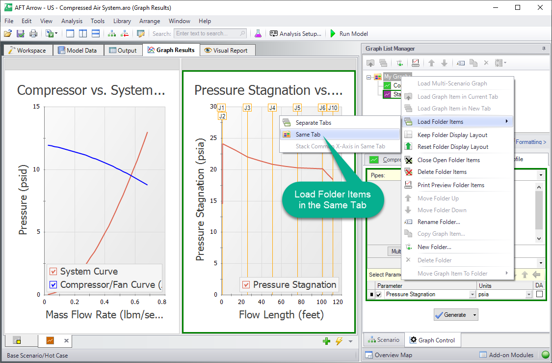
Figure 10: Both Graphs loaded into the same tab
It is also possible to create more Graph Folders other than “My Graphs”. The saved Graphs can then be organized into different folders that can independently be generated into their own tabs or a whole folder of Graphs can be generated into one tab.
Creating Graphs from the Workspace (return to top)
Note that some graphs can also be generated directly from the Workspace after running the model. To generate the Pressure Stagnation vs. Flow Length graph from the Workspace, select the flow path on the Workspace (you can select multiple pipes by holding the SHIFT button on the keyboard while selecting each pipe). Then, right click on the Workspace and select the Generate Profile Graph option, then choose Pressure Stagnation (see Figure 11).
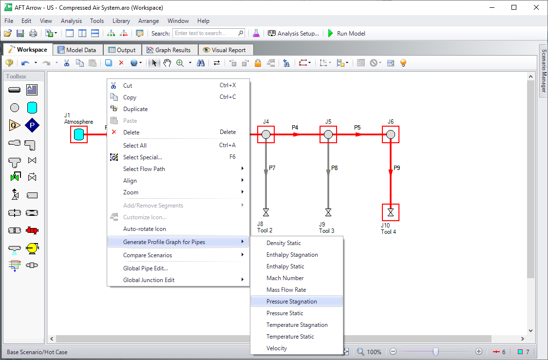
Figure 11: Several graphs can be generated directly from the Workspace