Visual Report Control
The Visual Report Control window (Figure 1) lets you control the content and appearance of the Visual Report window. You can also save custom Visual Report window layouts for later recall, so you don't have to reformat this window repeatedly.
When the Visual Report window is opened and no output results are currently displayed, Visual Report Control will be in the Input Display Mode. If output results are displayed, it will be opened in the Output Display Mode. Parameters available for display vary depending upon the mode, i.e. input or output.
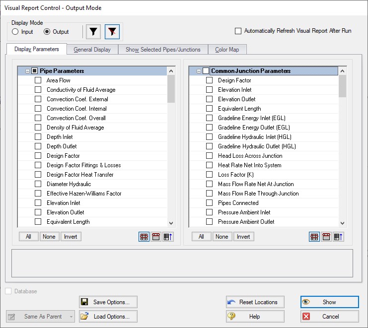
Figure 1: The Visual Report Control window allows you to configure the Visual Report display
Display Parameters
The parameters to be shown in the Visual Report window are selected from the Display Parameters tab. The left list selects the pipe parameters and the right list selects the junction parameters. The junction parameters list is sorted into common junction parameters, and specific junction parameters lists. Individual headers can be collapsed to make this list easier to navigate. Parameters selected under a specific junction type will only be displayed for junctions of that type.
The filter buttons at the top of the window can be set to show only the parameters you have selected in the Output Control window, or all output parameters. You can select more than one parameter; however, the Visual Report window may get crowded if too many are selected.
General Display
The General Display tab allows you to configure several items.
The analysis title, defined in Output Control, and filename can be shown or not shown depending on your preference.
The units for all parameters can be shown in a legend instead of next to the parameter value. This will reduce the amount of text and crowding shown in the Visual Report window. The legend can be moved to any location in the Visual Report window. If this option is chosen while in input only mode, all values will be converted to a consistent set of units.
You can change various font sizes by clicking the Change button beside any one of the three types of text-containing categories (Data/Text, Title, and Legend) under the Fonts header and choosing the font, font style, and font size desired.
Tip: The font and font size in the Visual Report can also be changed outside of the General Display in Visual Report Control by clicking on the Fonts button and the Font Size Up or Font Size Down buttons, respectively, on the Toolbar.
The number of digits to show in the numerical display can be configured using the provided drop-down list.
Normally on the Workspace, closed objects are displayed using special graphics (dashed lines, X’s, etc.). The number of a junction which has special conditions set, by default, has an X preceding the J (e.g. XJ56). If you want these symbols to be used in the Visual Report window also, choose the Show Closed Symbols checkbox. Normally, pipes in closed sections are shown as dashed lines, and junctions outlined with a dashed line. If you want these symbols to be used in the Visual Report window also, choose the Use Closed Object Style checkbox.
Show Selected Pipes/Junctions
You can choose what you would like to show in the Visual Report window on an individual pipe and junction basis. This display customization feature is useful for large models where only some of the data points are of interest.
Each pipe and junction is listed in their respective Display Options frames. Every object can display four pieces of information on the Visual Report - Number, Name, Data, and the Object itself. The display of these items is indicated by the existence of a checkmark in the corresponding box. To toggle the display of a particular item for a particular object, simply click the checkbox.
To restore the settings to what is shown in the Workspace and the data, click the Reset to Workspace Defaults button.
Multiple objects can have items toggled on or off at once by selecting the desired objects with the left-most checkboxes and clicking the corresponding checkbox at the top of each column. Multiple objects can also be selected with the standard selection buttons at the bottom of these panels.
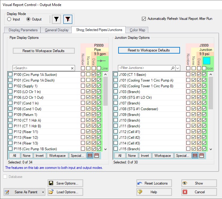
Figure 2: Show Selected Pipes/Junctions
Color Map
The Color Map feature allows you to visualize magnitudes of various parameters by coloring the pipes. There is one Color Map for the output mode and another for the input only mode. A Color Map is useful to show graphically where, for example, high velocities or reverse flows are located or to visualize the pipe diameters or lengths in a model.
To create a Color Map, first choose a parameter and units for which all pipes will be categorized. Then choose a color, select the operator (i.e. >, >=, =, <=, <) and enter a value, then press Add to Map. Values may be categorized on an absolute value basis by selecting this option.
The order of entry is not important. Fathom will sort the entries first by value and then by the operator, with the > being above the <. The pipes will be colored using the first match found in the map, starting from the top of the map. If no match is found, the pipe will be the Workspace pipe color. Be careful to avoid overlapping operators and values. If, for example, the map defined four colors using the following inequalities,
-
>=60
-
<60
-
>=20
-
<20
then there is no way colors 3 and 4 will be used because any pipe less than 20 is also less than 60. Since <60 is before <20 in the map, the pipe will be colored using 2.
To avoid overlapping colors, only use less than (<) as the last entry. A better map would be to use
-
>=60
-
>=20
-
<20
You can choose to categorize the pipes based on their absolute values by choosing the Display Absolute Value checkbox. To delete a map value, click the color you want to delete then click the Remove Setting button.
Instead of coloring the pipes, you could choose to color just the pipe numbers. This is done by choosing the Color Pipe Labels and clearing the Color Pipes checkboxes in the Color Options area. You could also apply the colorization to both. Choose the Print Black & White checkbox if you don’t have a color printer. The pipes will be printed in black.
The color map values can be displayed in a legend by checking the Display in Legend checkbox. The color map will appear in the legend after the pipe and junction units, if that option was selected. The legend may be dragged and dropped to any location in the Visual Report window.
An automatic color map can be generated for you by selecting "Auto Color Map". This feature will generate a color map using greater than (>) conditions to divide the difference between your max and min value into the number of conditions. These conditions will have their own unique color that is automatically set on a rainbow spectrum. These colors can be manually changed by selecting the "..." button.
Saving Visual Report Layouts
The parameters and text locations for the Visual Report are automatically saved with the model. The Visual Report Layout can be adjusted and saved for individual scenarios.
It is also possible to save the settings for use with a different model. To save your preferred layouts to an AFT Fathom visual layout file, click the Save Options button and assign a file name. The default file extension is .fvs. Later you can load your customized layouts for rapid preparation of the Visual Report window.
Related Topics
Related Blogs