Basic Graph Tutorial
Generating Graphs is a powerful tool for analysis. Below are step by step instructions about how to make and manage graphs from one of the example models. Many of the graphs created in this example will be multi-scenario graphs. However, the information discussed within is the same regardless of which scenarios are selected.
For this example, the “US - Ammonia Transfer with Cavitation.imp” file was used. The file should be at this location by default C:\AFT Products\AFT Impulse 9\Examples\US - Ammonia Transfer with Cavitation.imp. It is recommended to “Save As” the file under a different name and location to prevent altering the example files.
Open the model and run all the 0.5 Second Closure, 1 Second Closure, and 2 Second Closure children scenarios. Return to the "0.5 Second Closure" scenario.
To skip to different sections of this tutorial, use the links below:
Transient Junctions and Saving Graphs (return to top)
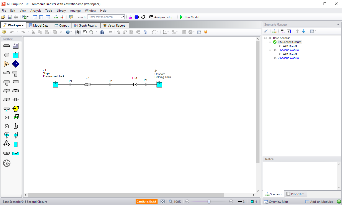
Figure 1: Valve Closure Example
Go to the Graph Results Primary Window and determine what type of graph you want to generate. The first graph created in this example will be a Transient Junction Graph. The Transient Junction is one of several different types of Graphs that can be made. This graph is created by first selecting the Transient Jct tab and selecting the desired parameters. The only junction with saved transient data will be the valve J3. Add this junction to the “Graph These Junctions:” column by double-clicking the junction ID number, or selecting the “>” symbol. Select “Cv” as the parameter. Select the three scenarios using the Multi-scenario... button, and then select “Generate”. This creates a plot of “Cv vs. Time” for all three scenarios on the left.
Note that the Graph Guide, accessed by clicking on the "What Would You Like to Do?" icon on the upper right of the graph, can help guide you through the process of creating a graph
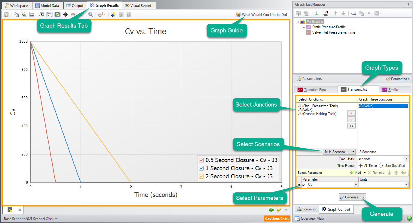
Figure 2: Valve Cv vs. Time
The Graph has been created, but has not yet been added to the list under “My Graphs”. To add this Graph to the list, first select the “Add Graph to List” icon on the Graph Results toolbar (this option and many others can be accessed by right-clicking on the Graph at any time). Name the Graph “Valve Cv vs. Time”. The Graph has now been saved and will be easily regenerated with the same format if the output changes. The name of the saved Graph can be seen in the Graph List Manager, with two small squares in the icon associated with it indicating it is a multi-scenario graph. The border of the Graph has also changed to dark green along with borders of the parameters and the name of the Graph in the Graph List Manager, indicating the Graph is current, saved, and that the displayed parameters are the ones used to generate the Graph.
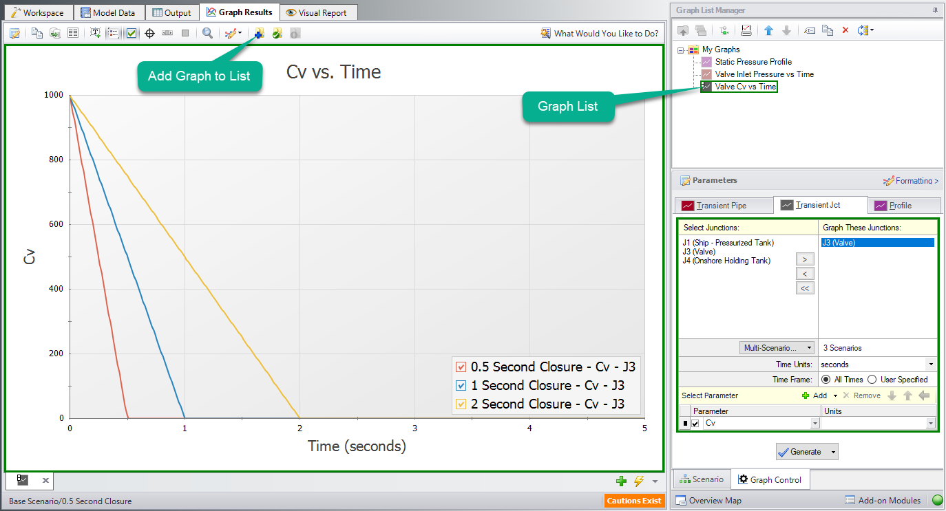
Figure 3: Adding a Graph to My Graphs
Formatting options are available by selecting “Formatting” above the different graph types. When formatting changes occur the border of a Graph will change from dark green to light green, indicating a change has been made to a graph in the Graph List. Another indicator that the Graph is not saved is the small yellow square over the icon on the tab. Here, the title has been changed from “Cv vs. Time” to “Valve Cv vs. Time”. Once the formatting settings have been changed, This change and other formatting changes are not retained to the Graph unless “Update Current Graph in List” is selected.
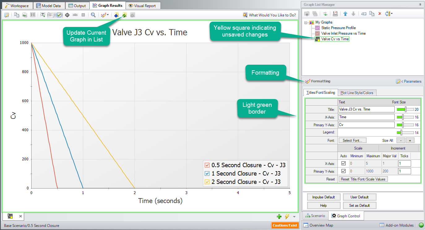
Figure 4: Update Formatting Changes to Graphs
After selecting “Update Current Graph in List” the border has changed back to dark green and the yellow square has disappeared. This indicates that this is the current formatting of this graph, and that regenerating this graph will generate the same graph (according to the current model output).
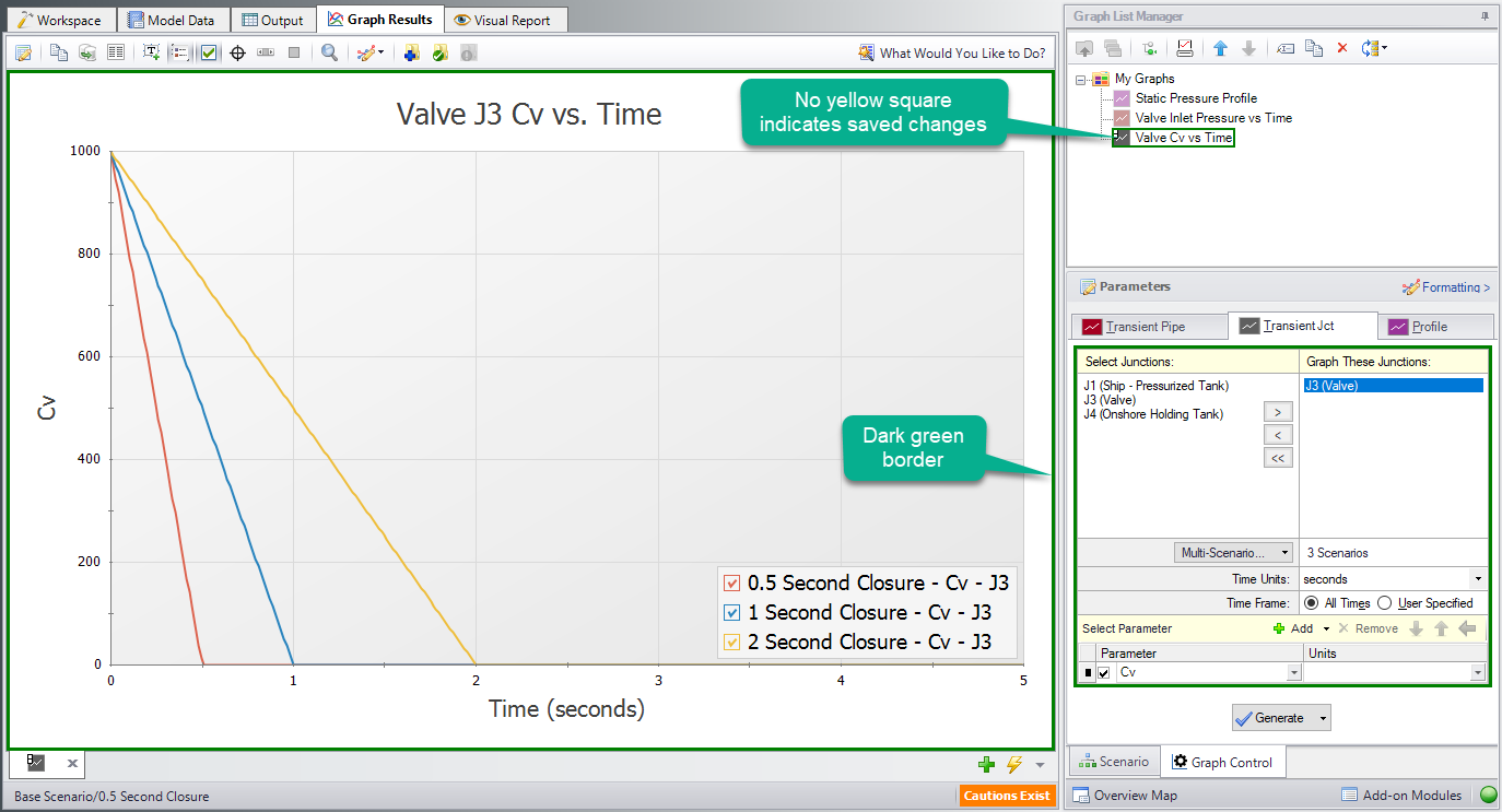
Figure 5: Valve Cv graph with updated formatting changes
Transient Profiles and Animations (return to top)
The next step in the example is to make a new Graph in a separate tab. This is done by selecting the “New Tab” icon in the lower right. This Graph will be a “Profile” Graph that displays Static Pressure along the length of the flow path. Select pipes 1, 2, and 3 in the system and change the parameter to “Pressure Static” with units of length in feet and units of pressure in psig. Make sure that the Mx and Mn boxes are checked to display the maximum and minimum stagnation pressures.
Note: An easy way to select the pipes in a longer path would be to select them in the Workspace, then click the Workspace button under Pipes to automatically select the desired path. This method is discussed further below.
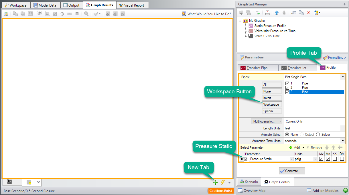
Figure 6: Generating a Profile plot with Min and Max Pressure Stagnation
The graph shows the minimum and maximum static pressures during the transient simulation for each pipe station along the path. This Graph is the same as the saved "Min/Max Static Pressure Profile" Graph List Item. We could have generated the same graph by loading that graph instead. Save this new graph to replace the saved Graph List Item, or create a new entry. The graphs we have made can be switched quickly between by either selecting the Graph from the list, by clicking on the corresponding tab, or using Graph Tab Selection.
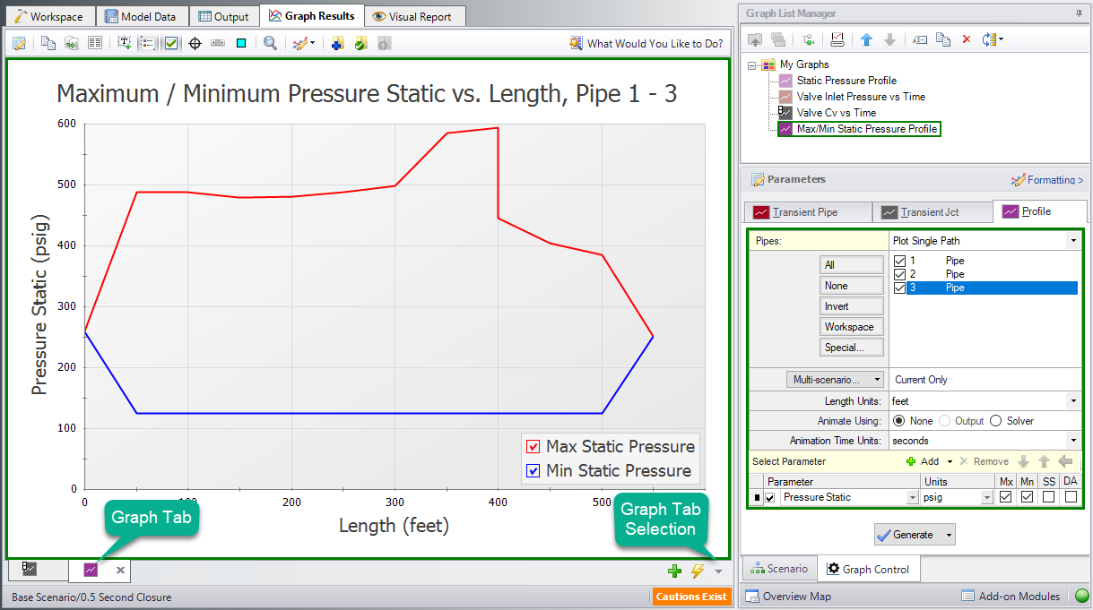
Figure 7: Pressure Stagnation vs. Flow Length Profile added to Graph List
This is a useful graph, but animating the pressure profile over time can provide even more information. There are two animation options available. Animating from the Output file requires that all data for the pipe stations being animated to be saved to the Transient Output File using the Output Pipe Stations panel. This gives more flexibility to move the animation forwards and backwards in time, but makes the run-time longer. Animating using the Solver option does not require output for all stations, but instead reruns the solver. This takes longer to graph and has less accuracy, but allows for a shorter model run-time. This model was set to only save data for pipe inlet and outlet stations, so we will use the "Solver" option. To use the Animate via Output option, return to the Output Pipe Stations panel and change which Pipe Station output is being saved.
After selecting generate the Graph will now allow for animation with options to Play, Record, Stop, and manipulate the animation in other ways. The recorded animation can be exported to a video file for convenience.
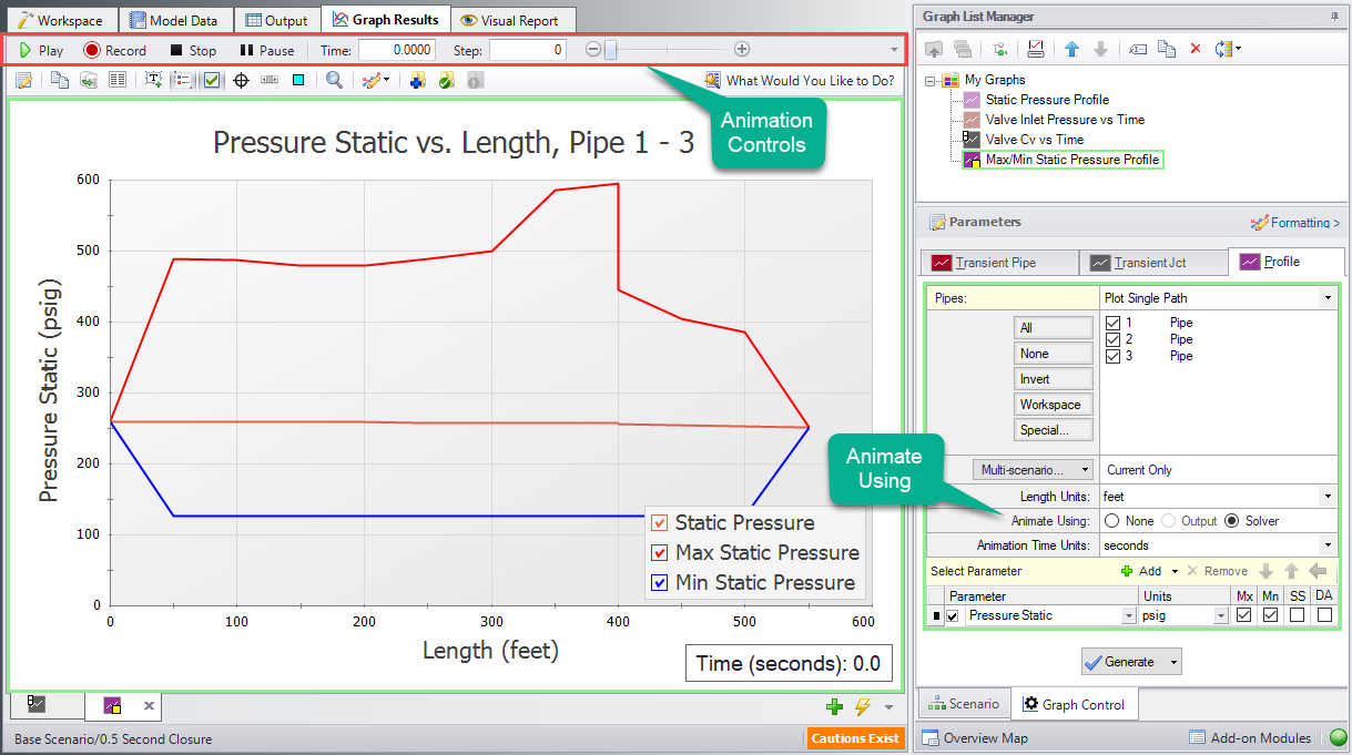
Figure 8: Max/Min Profile Graph with Animation
Displaying Multiple Graphs Simultaneously (return to top)
Another option that is available is to add another parameter to the graph. This is called generating stacked graphs. To do this select “Add” next to “Select Parameter”. This will graph an additional parameter that shares the same X-Axis as the original parameter. For this example, select “Pressure Static” as the parameter, but with units in barG rather than psig.
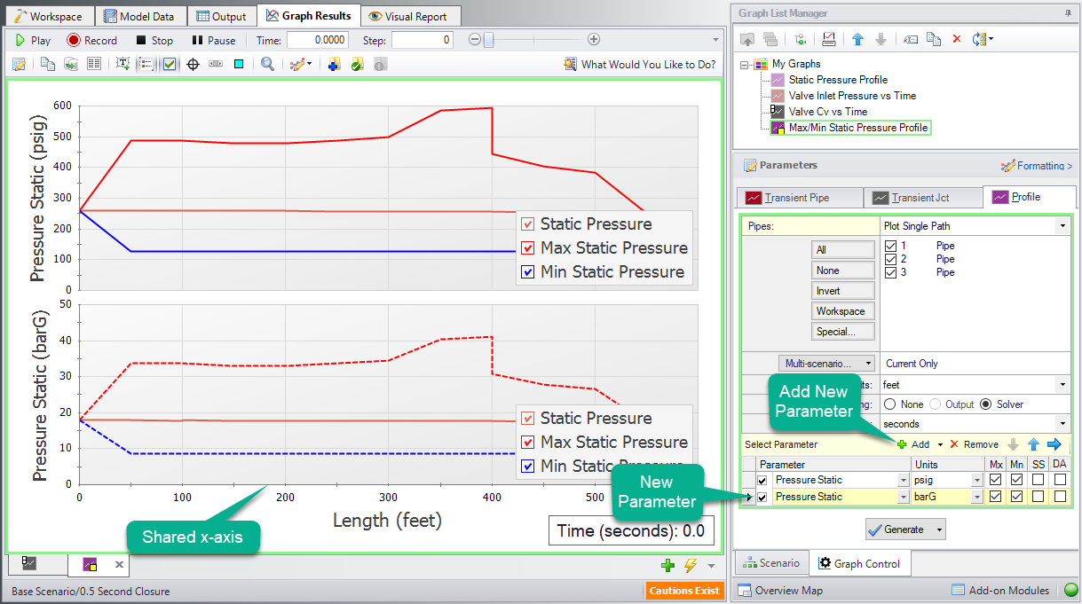
Figure 9: Stacked Pressure Profile with different units
We now have the same plot twice, which is not the most efficient way to view this data. A better way would be to have the secondary parameter (which could be any of the available options for a profile plot) on a secondary Y-Axis. This can be done by double clicking on the arrow to the left of “Pressure Stagnation: bar” or by selecting the blue right arrow on the “Select Parameter Row”. This will visibly indent the secondary parameter. When the Graph is regenerated it will now only be one plot of Pressure Static vs. Length, but it will have units displayed in psig on the primary Y-axis and units of barG on the secondary y-axis.
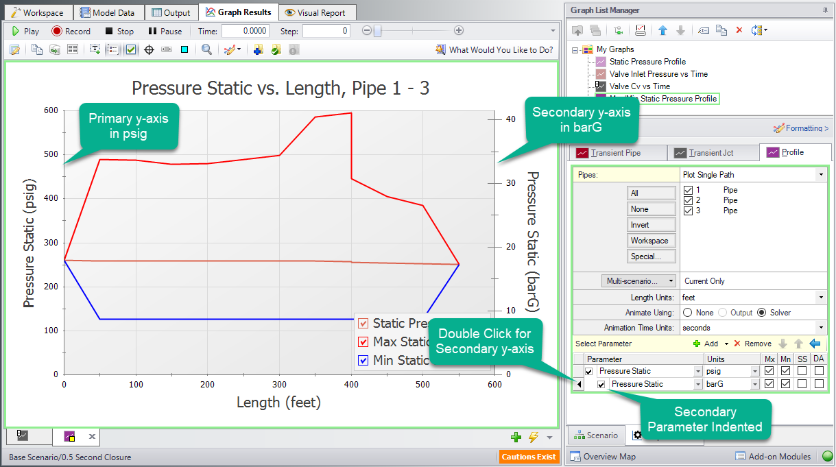
Figure 10: A Single Graph with Alternate Units on a Secondary Y-Axis
Update Current Graph in List button. The Graph is now complete and can be easily regenerated if input data is changed on the Workspace and the model reran. It can also be used to generate the same graph for data from other scenarios.
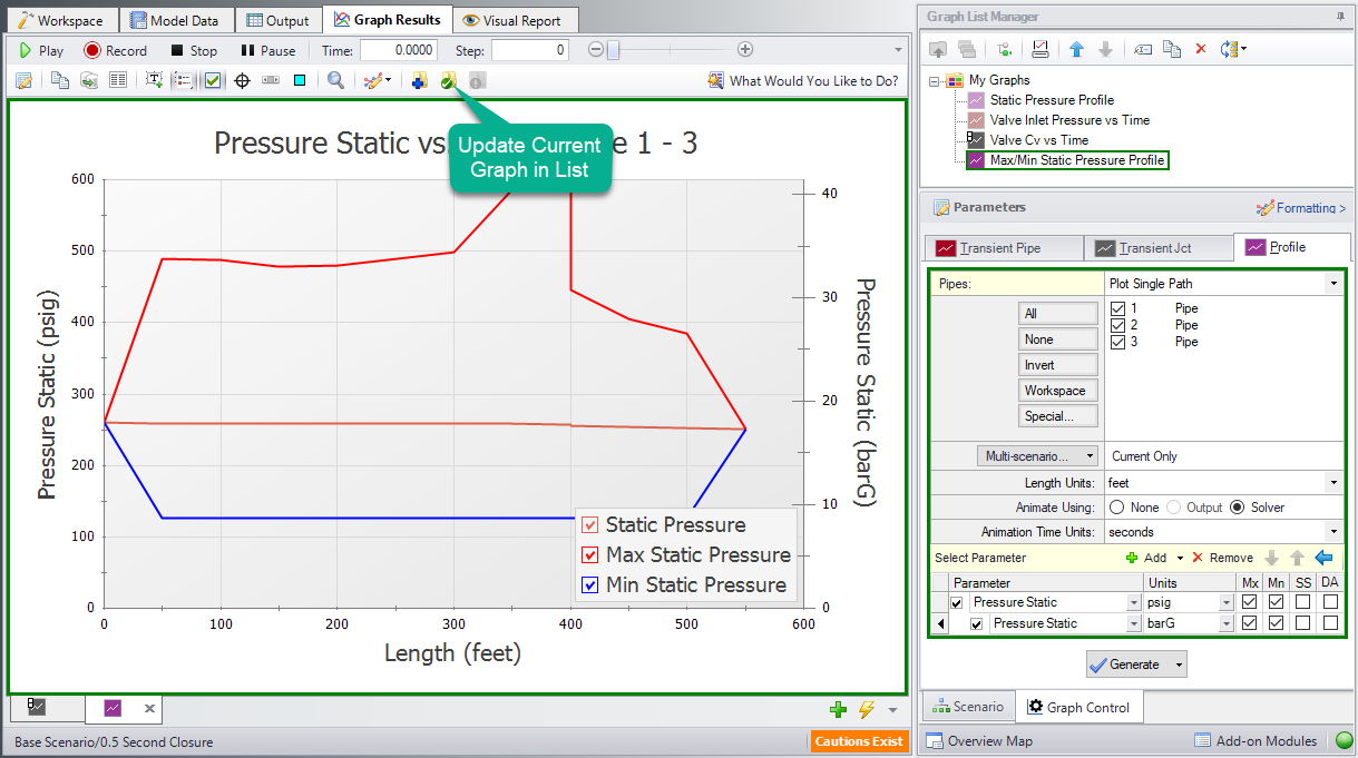
Figure 11: The Resulting Graph when it is Updated
It is now possible to close the Graphs and regenerate them either in their own tabs or all graphs in a folder in the same tab. To test this out, close both Graph tabs and then select the “My Graphs” folder. Right-click on the "My Graphs" folder and then choose “Load Folder Items” and then “Same Tab”. After the Graphs have been loaded in the same tab, the tab icon changes to an orange square, indicating that multiple Graphs are being displayed on one tab. All graphs will now be animated, with a vertical red line appearing on the graphs with a time axis. This red line will move over the animation time to compare values more readily.
Depending on the monitor display being used, or the number of graphs being displayed, this view may be easy to view or difficult to see data. For the sake of this example, we've kept the display size relatively small, meaning it is more difficult to view the data on all the graphs. However, with larger monitors available, it is likely easier to view this data.
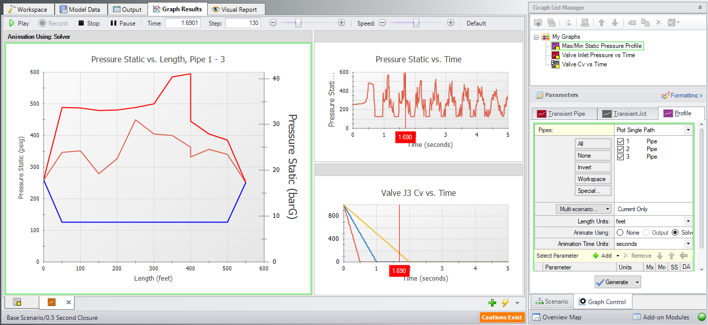
Figure 12: All graphs loaded into the same tab
Other ways to view multiple graphs simultaneously are to plot them as stacked graphs, as we did previously for our pressure profile in psig and barG, or to plot saved graph items in two tabs either stacked or side-by-side. Right-clicking on a Graph-Tab at the bottom of the window shows the options for displaying two separate tabs.
Since we have two Time graphs with the same X-axis, we can display them in a single, stacked graph. This approach to viewing graphs can be especially helpful in examining how a junction transient is affecting output parameters nearby. To create a stacked graph of multiple Graph List Items, first make sure both items have the same time scale. Both of our example graphs do. Then, move them into their own folder. Here, we've created a new "Profile" folder, and moved our Max/Min Static Pressure Profile graph into it. Finally, right-click the My Graphs folder, select "Load Folder Items", and then the "Stack Common X-Axis in Same Tab" option.
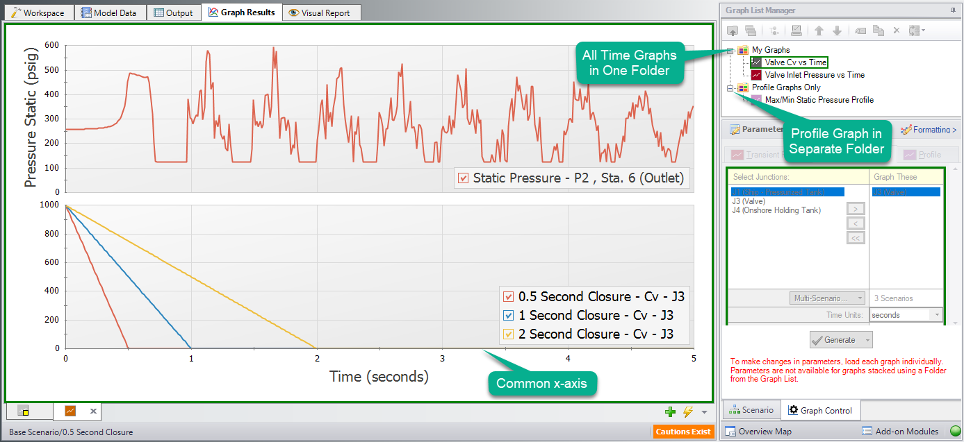
Figure 13: Load Current Folder Graphs in Same Tab - Stack Same X-Axis
As we just saw with the Profile Graph Folder, it is possible to create more Graph Folders other than “My Graphs”. Saved Graph List Items can then be organized into different folders and can independently be generated into their own tabs or a whole folder of Graphs can be generated into one tab. Using multiple folders will allow the user to create many unique variations of animations or other Graphs that can be used to convey transient output in a meaningful and intuitive manner.
Creating Graphs from the Workspace (return to top)
Some graphs can also be generated directly from the Workspace after running the model. To create a graph for the valve inlet and outlet stagnation pressures from the Workspace right click on the valve J3, choose “Create Transient Graph for connected pipes (Inlet/Outlet)”, and select “Pressure Static”.
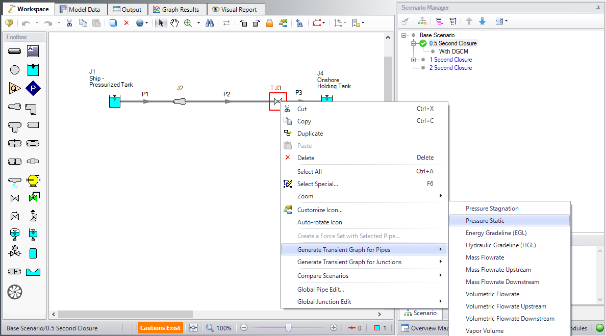
Figure 14: Creating Transient Graphs of the Inlet/Outlet Pipes Connected to a Junction
This will automatically generate the requested Graph with default units. Add the graph to the “My Graphs” folder using the Add Graph To List button and name it "Valve Inlet/Outlet Pressures". This is a quick and easy way to see the pressure difference across the valve. Notice that this graph will be a Transient Pipe graph, since the pipe inlet/outlet stations are being used to graph the equivalent valve inlet/outlet values.
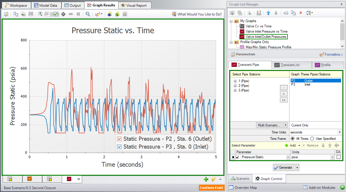
Figure 15: The Pressure Stagnation vs. Time of the Two Pipes Connected to Valve J3
Make one more Graph from the Workspace by right-clicking pipe 3, selecting “Create Transient Pipe Graph”, “Volumetric Flowrate Downstream”, and then “Outlet Only”.
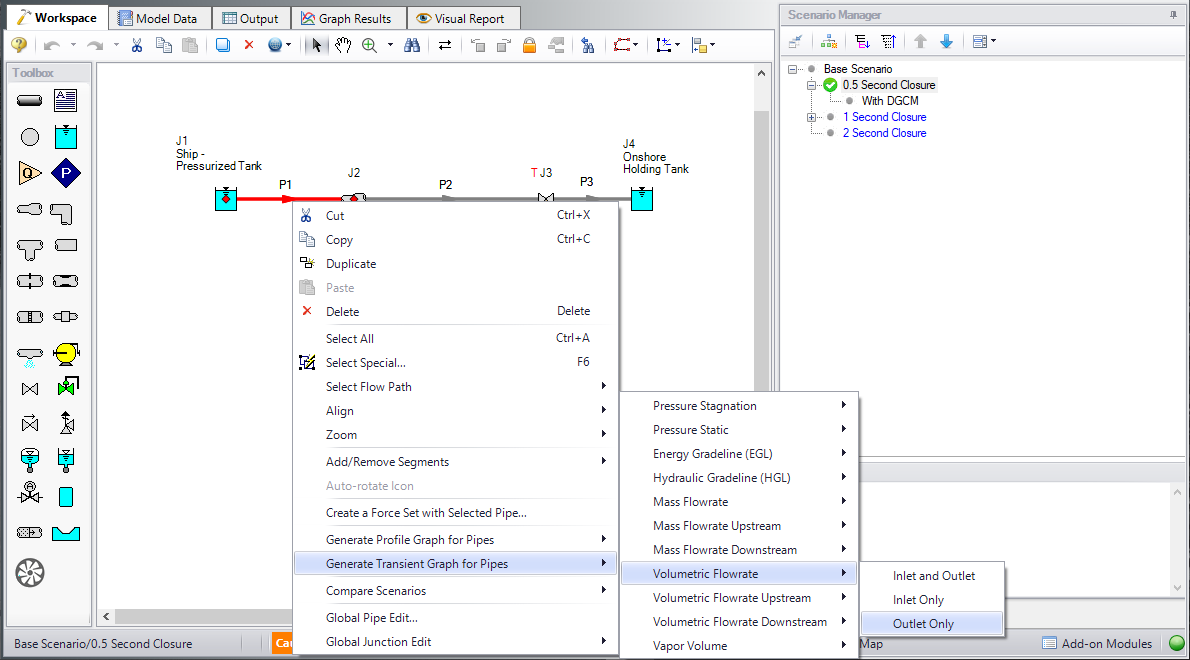
Figure 16: Graph the Changes to Volumetric Flowrate vs. Time from the Workspace
This will add a Graph of the Volumetric Flowrate at the Outlet Station of pipe 1. Add the graph to the Graph list and name it "Pipe 1 - Outlet Volumetric Flowrate".
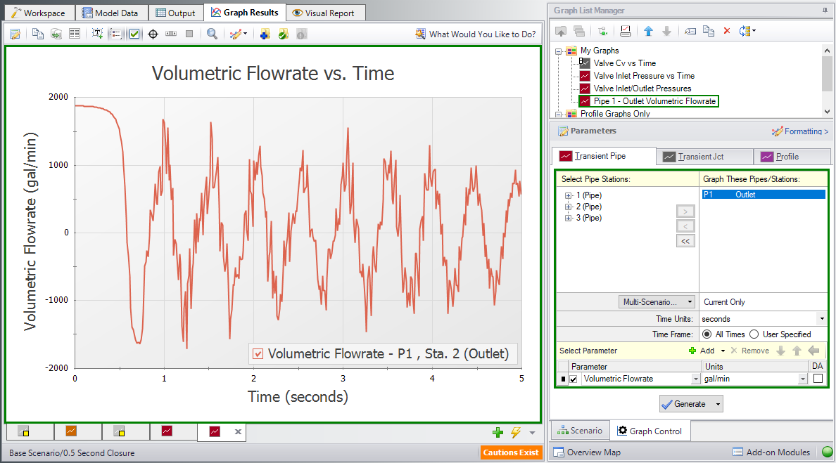
Figure 17: Volumetric Flowrate Downstream vs. Time at the Outlet of pipe P1