Color Maps and Animations
The Color Map/Animation layer is an Advanced layer that allows the visualization of various parameters directly on the Workspace through the use of Workspace Layers. This layer contains two display modes: Color Maps and Animations. These modes allow for the display of parameters at a single instance in time, maximum values, minimum values, and animated results to see how a parameter varies over time.
Note: There can be only one advanced layer visible at a time, and they override the behavior of standard layers in the model - in this case superseding any colors assigned to pipes by other layers.
Color Maps
By color coding pipes, Color Maps provide a clear representation of a range of values allowing for quick identification of areas of interest within a piping system. This is complemented by extensive customization options allowing the flexibility to tailor the color schemes and parameters to suit the needs of the system. Example use cases for Color Maps includes visualizing pressure surges, locations of high velocity/reverse flows, or pipe diameters and lengths.
To create a Color Map layer, click the new layer icon on the Layers Toolbar, select the Color Map/Animation layer type, and name the new layer. To edit the layer, go to its Layer Settings menu, accessed in the same manner as a standard layer.
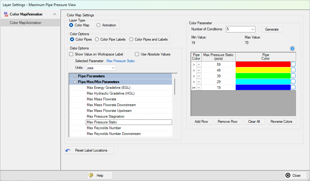
Figure 1: Layer Settings window for a Color Map
In the Color Map Layer Settings window, choose a parameter and units for which all pipes will be categorized. In the Color Options section, the method of coloring objects on the Workspace can be selected by coloring the pipes, the pipe labels, or both objects. The color coding and range is automatically generated based on the maximum and minimum values in the model if they are known. The Number of Conditions (number of colors), operators (i.e. >, >=, =, <=, <), and values can be modified. Values may be categorized on an absolute value basis by selecting the Use Absolute Value check box. The Show Value on Workspace Label option shows the evaluated parameter next to each visible pipe in the model and combines with any other label text items from other layers.
The order of entry is not important. Fathom will sort the entries first by value and then by the operator, with the greater than (>) operator being above the less than (<) operator. The pipes will be colored using the first match found in the map, starting from the top of the map. If no match is found, the pipe or label will remain as the Workspace pipe and label color. Be careful to avoid overlapping operators and values. If, for example, the map defined four colors using the following inequalities,
-
>=60
-
<60
-
>=20
-
<20
then there is no way colors 3 and 4 will be used because any pipe less than 20 is also less than 60. Since <60 is before <20 in the map, the pipe will be colored using color 2.
To avoid overlapping colors, only use less than (<) as the last entry. A better map would be the following:
-
>=60
-
>=20
-
<20
Color choices from the Color Map Grid will appear in a legend without units shown by default. The legend may be repositioned by dragging it to any location on the Workspace. Units may be displayed in the legend using the Show Units in Legend setting within Global Layer Settings.
If there is no output for the current scenario, any Color Map layer that displays an output parameter will have a red exclamation mark next to it on the Layers panel to warn the user that there is no output. The model must run before such Color Map layers can be displayed.
Color Maps can be animated for transient data using Animation Layers. Animation Layers allow users to visualize how pressure and flow waves move through a piping system during a transient simulation. Unlike static graphs, animated color maps show how waves propagate, reflect, and interact in complex systems, especially through branching paths. By selecting the Animation option in the Layer Type section, this will change the layer interface to the Animation layer setup.
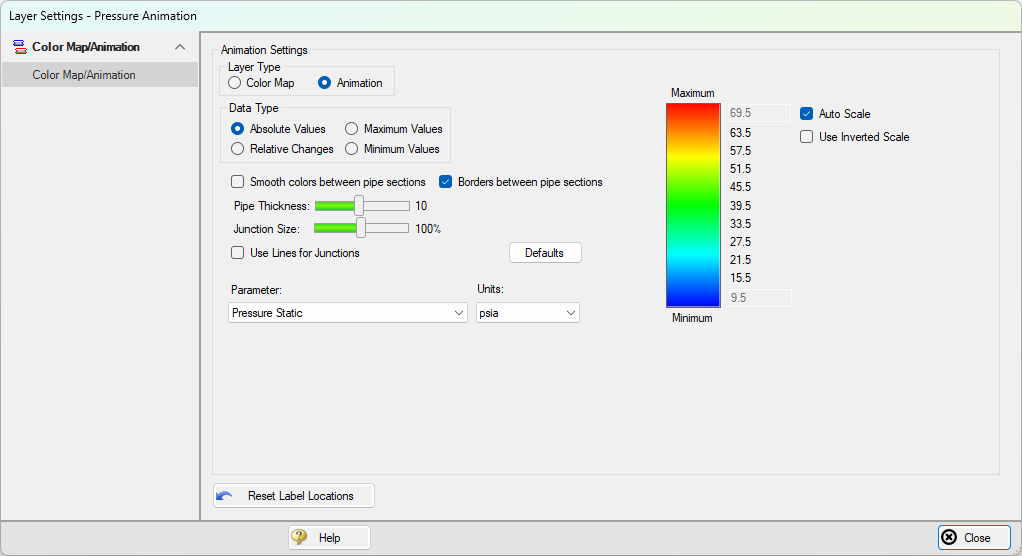
Figure 2: Layer Settings window for an animated color map layer
The animation is configured in the Layer Settings by selecting data types (e.g., Absolute Values, Relative Changes, Maximum/Minimum Values) and customizing visual options like color gradients, pipe thickness, and junction styles.
Once enabled, the animation can be played, paused, or recorded as a video. On the Workspace, the interface includes controls for time/step navigation, playback speed, and value scaling. These animations are a powerful tool for interpreting system behavior in events like water hammer or valve closures. For more information on Workspace animations, see the full explanation of these layers on the Animation Layers page.